Not easy, is it 
I need to anchor stuff to top and bottom of the screen, too - a title at the top, a call-to-action button at the bottom, and it’s going to be quite a complex process. We have all the tools we need: we can find out the screen aspect ratio, we can trigger a script when the orientation changes and/or when the device resizes the screen. We can even calculate the camera’s focal length (useful in my case - I want to have our title graphic start on the target image, then smoothly fly up and lock to the phone screen)
The hard part (at least for me) isn’t the code, so much as deciding artistically what the logic should be when a user has their phone in landscape mode. Newer iPhones in landscape mode lose a third or more of their screen height to browser tabs and address bar stuff, leaving you with a really thin but wide strip of canvas to play with.
I don’t think it’s possible to have the same set of UI stuff fit both of these:
… at least, not just by repositioning and rescaling the same “block” of UI. And these are extremes of wide and tall, but iPad users have much squarer canvasses to play with, whether in landscape or portrait layout.
I suspect I’m going to have to do some convoluted “if the aspect ratio is very wide, have my buttons in one row, but if it’s very tall and thin, have my buttons in two rows, and if it’s more square, scale it a bit differently” kinda logic.
Not an easy problem to sort out.
That said, your cropping issue is something we ought to be able fix. It’s really hard to diagnose what your particular problem is, as there are lots of interrelated settings and whatnot, and trying to describe (in crappy ole’ English words) how your hierarchy of things should be is tough and error-prone.
If I have time later I’ll try and set up an example project, but you could always pop your project up here for us to see (or put it somewhere private and PM me a link if it’s sensitive)


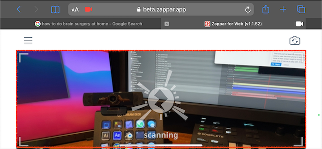
 yeah cropped out cause of positioning.
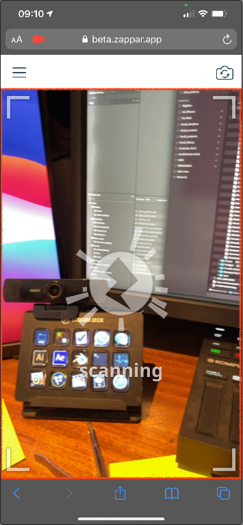